Tuesday, 24 January 2017

I had the idea of cutting an image up into rectangles with each one getting smaller and smaller and then moving each piece slightly to the right. This composition was not successful, I really struggled with the process as I initially used a ruler but found it kept moving or the paper kept moving so I did it free hand which then obviously wasn’t straight which I think ruined the overall effect of the piece and disrupted the sequence and balance of the composition. It also failed to succeed as I thought it would change the shape of the figure in a weird way however it actually covered up most of the figure in the photograph because of how I stuck it down which meant that the focus actually became the way it was put on the page rather than a distorted figure which was not what I wanted to achieve with this piece.
I did a monochrome photocopy to see if the piece looked more successful in black and white. It didn’t really work as the original composition in colour was not successful because of the way I had cut the shapes which then transferred onto the black and white copy. I do however prefer the coloured version as you can see more clearly what is in the photograph where as the figure seems to blend in with the background of the image in this composition because the dark tones are very similar.


I decided to print the image on acetate and use the same technique I have been doing previously, however I decided to put and image underneath to see what effect it would have on the piece. I think that this piece is very successful and I love how it gives it a pixelated look with the overlaying of the shapes on the right side of the composition. The piece looks very symmetrical and I think the translucency of the acetate print works really well with this technique.


I chose the one on the left because the image seemed to flow better and it was moving in the same direction that the figure was leaning to in the photograph. I think the composition was more visually satisfying when going from left to right, perhaps it is a language thing as here we read and write from left to right so maybe it is the familiarity of it that makes it preferable. 
As the first try was not successful I decided to try it again. This time I printed the photograph slightly bigger and I used a ruler and measurements to cut out each shape. Once I cut it out I decided to arrange it going right to take a picture and then do it again but going left so I could compare them and see which one was better. I think this piece is much more successful than the original now that it has been refined. I really like it and could see this developing into a potential final outcome.
As I had been experimenting with stitching things together inspired by my artist Annegret Soltau I decided to combine it with this piece by stitching the cut out shapes together. I hated doing this composition, it took me ages to actually finish stitching it as they were so close together and the cartridge paper was thicker so it was harder to push the needle through. I don’t feel like this piece is very successful, I feel like the stitching ruins the composition and upsets the balance of the piece. The lack of white space between the shapes makes it seem very busy and takes the focus away from the figure and the technique of the collage which I am not happy with.
I decided to try the stitching on this composition again however this time I wanted to use less thread and I decided to make almost triangle shapes following the direction of the piece so that the string was perpendicular meeting at a point towards the right. I think that this composition is much more successful as it appears to be more balanced and symmetrical, with more space to counteract the photograph.

Birmingham Art Gallery Visit


As my London gallery visit was not as successful as I had hoped, I decide to got to the Birmingham Art gallery as I had done some research and found that there was quite a lot of work there to do with my theme of figures. These were the photographs of the artwork that I felt were best. There was a lot more artwork in Birmingham that linked really well with my Component 1, from figurative sculptures, to photographs of people much like how I have been using my own photographs of people. This was especially important as my theme for Component 1 is figures, so it meant that there was a lot of different pieces of artwork that were very helpful and inspiring. The colour blue was really emphasised in the exhibition 'Night in the Museum' I went to see in the gallery and it really inspired me to strongly stick to this as a colour theme for my own work. I personally felt that there was a lot more to see in the Birmingham Gallery than the London National Gallery, I think perhaps this is because the exhibition was on at the time I went to the Birmingham Gallery.


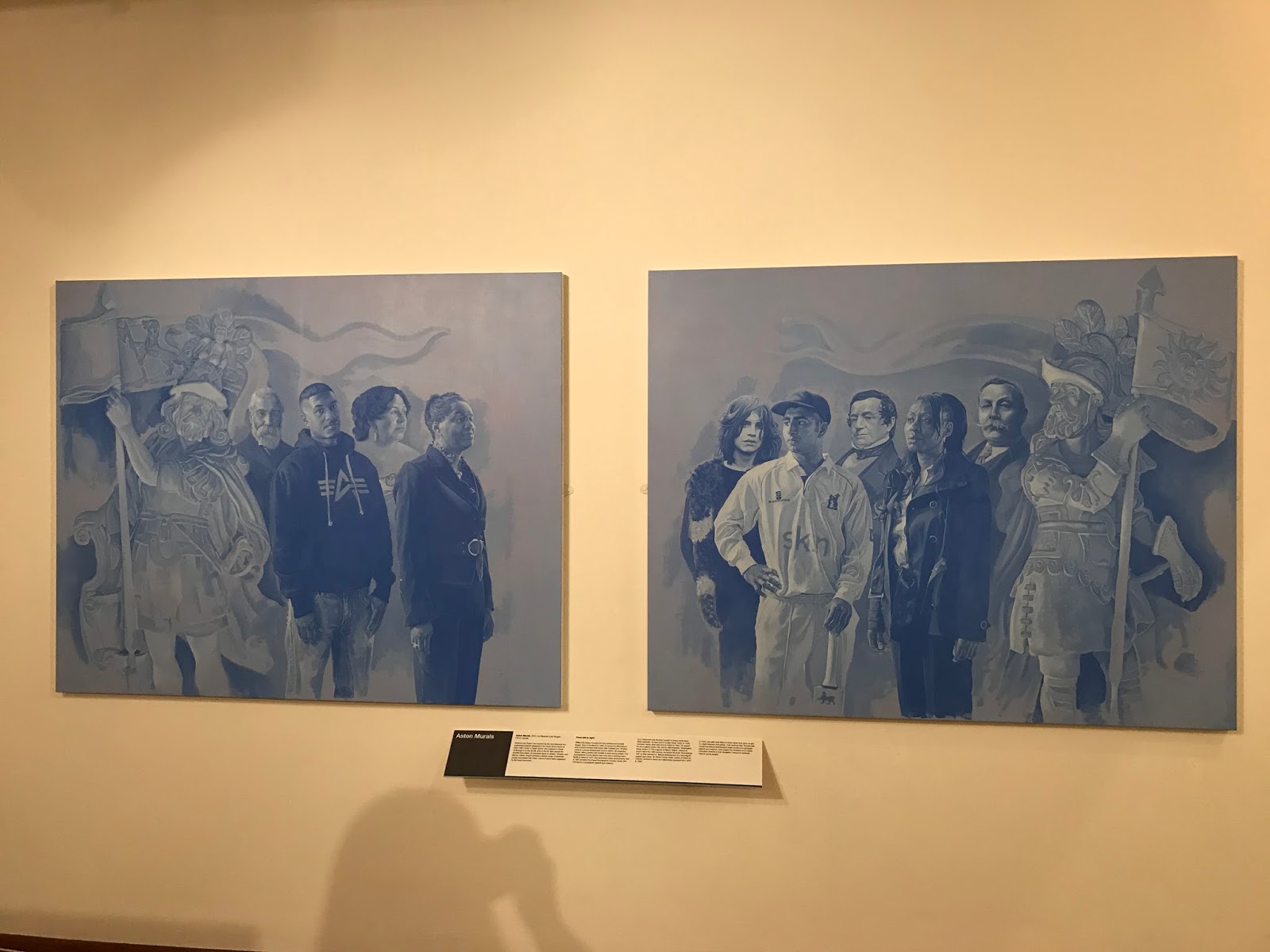
I fell in love with this photograph because it is so simple, looking like a family portrait, however the composition with the placing of the people and the lack of colour really makes you focus on the people themselves. How they are standing, the expressions on their faces, I feel like you connect more to the people in the photograph because you just focus on them, and not the colours of their clothes or any other coloured things that can distract you from what you are really looking at.


I really liked these two pieces together, I loved the different tones created by the different shades of blue to create the people in the piece and the contrast between the lighter shades of blue and the darker shades. It links quite well to what I have been doing as I have used a lot of photographs in my work that are made up majority of blue colours, blue had predominantly been the colour I have been using for my photographs as they all contain water. t also links to the exhibition that I also saw in the Birmingham gallery where the primary colour focus was blue.


Exhibition:

There was an exhibition on called 'Night in the Museum' which was created by the artist Ryan Gander. The exhibition was made up of lots of modern and contemporary art. In the film where he was talking about the exhibition he said that people go to galleries and do a lot of viewing of sculptures, sculptures are always viewed and never do the viewing. So the idea behind the exhibition was to take sculptures of people and place them so that they are the ones viewing the artwork, meaning that we are the viewers of the sculptures viewing the artwork. Gander said that there had to be blue in all of the artwork that the sculptures are viewing, he described blue as the colour of infinity. The sky is always blue, day and night, no matter how light or dark it is, screens on standby go blue and will remain blue until turned on again. Gander talked about the colour blue so passionately and thoughtfully that I found it really inspiring and it made me look at my own work differently as I had also been using the colour blue a lot.


This is a sculpture of a woman who is lying on the floor.
Behind the sculpture is a giant blue cube.

I thought this sculpture was quite interesting, it was an engine type thing that was completely covered in these blue crystals. I felt that the blue was very hypnotising, it was so deep and sparkly that I fell in love with the colour. Being surrounded by so much blue in the exhibition changed my perspective of the colour and I noticed that as I walked around I was automatically looking for the slightest thing coloured blue, even after I left the exhibition my eyes were drawn to anything that specifically had the colour blue in it.

This is a figurative sculpture facing a blue cube that has a white light inside.
Hanging above the cube is blue glass orb.

This is a sculpture of a woman sitting down. The
sculpture has been placed so that it is looking at a blue TV
screen which links back to what the Ryan Gander was saying
about a blue screen being infinity.


This was my favourite sculpture in the whole exhibition. I loved how creepy and unusual it looked even though you could still tell that it was clearly a person. The lighting had been placed above and in front of the artwork that the figure was looking at to create the shadow behind on the floor. I loved the layout of the exhibition because the shadows made it feel more real, I felt like the sculptures were real people and that I was actually standing there with them observing the artwork. I spent more time in this exhibition than I did looking at the rest of the gallery because I loved it so much.

I was actually more fascinated by the blue patterned background on the wall than the sculptures in from of it in this section of the exhibition. The BLUE pattern on the wall reminded me of the styles I had been doing when paper cutting, with the geometric shapes. I loved the simplicity of the background because when you think about it, the painting is a really simple thing, however when you look at it, it appears a lot more complex - just like my paper cutting experiments.


This sculpture was one of my favourites in the exhibition. It was interesting as the sculpture itself was blue unlike all of the other sculptures in the exhibition. I also though that sculpture reminded me of cubism as it was made up of these tiny coloured plastic cubes and it also is a bit distorted. I find it quite interesting as well that one half of an arm is missing, it makes it seem like a 3D pixelated character that hasn't been finished yet as it stopped before it had finished being created.

This piece is also inspired by David Hockney, I cut the photograph up into small squares and then removed the ones that didn’t have any parts of the figure in. I arranged them with small gaps in between to give the impression of Polaroid photographs. I really like this piece I think it is simple yet effective and the absence of the rest of the image makes it seem almost like pixels that are slowly forming to make up the whole image however it hasn’t quite finished yet as it has froze which is what I personally feel it gives the impression of which I quite like.


Whilst I really like the original coloured version of this piece I love the contrast between the cut up squares of the photograph and the white background, I think it really makes the composition stand out. The monochrome print appears to really highlight the light shining through the water which I really like as it gives the composition more atmosphere and energy. I think that the piece looks like the person is disappearing as there is a lot of white space to the right of the piece making it look like the image is unfinished and is fading away before it has been pieced together again, hence the white gaps between each square.


I decided to try and incorporate my stitching into this piece to see how it would look as I have started combining my techniques to develop my experiments further. I didn’t finish this piece because after doing a bit of stitching I realised I didn’t really like the effect the stitching was having on the piece and because I knew it was going to take a while I decided I didn’t want to spend ages finishing it when I knew I was not going to like the outcome.
This piece was inspired by Annegret Soltau’s work. I particularly focused on her compositions where she ripped out a hole in the middle of the photograph and stitched them to another image underneath and I decided to combine two photographs featuring the same person. I think that this piece is really successful because composition is structured well. I think that this piece looks like the person is jumping into another universe which I really like.
As the two figures in this photograph had just their heads and shoulders out of the water I decided to combine it with another photo containing a figure with just his head and shoulders out of the water. The similarities between the two photographs help to balance the composition and make it work as there is a clear link between the two photos. I think this piece is really successful because it looks like the other image is supposed to be there other than the slight change in the shade of blue. 
I decided to try stitching a ripped section of a photograph with only a small section of it being on the photograph. I chose these two images because the figures are both looking in the same direction. I think that this piece is kind of successful however I think the technique of ripping a hole in the photograph seems more successful than this style, perhaps because the composition is more balanced where as this piece isn’t really balanced because of the overlap on the bottom right.
I chose these two images because they are both underwater so I thought they would fit well together. I decided to rip the photograph by trying to go around the figure but still keeping it quite central. I think that this composition works well because it is well balanced structurally as it looks like it has near enough been slice equally from top right to bottom left. The colours from both photographs were very similar and blended well together.
I decided to go back to stitching with a hole in the middle of a photograph as I felt that these ones were more successful. I picked these two photographs because I felt that the shades of blue in the water were very similar and also the arms look like they are reaching out in the direction of the two figures in the water. I think this composition is not as successful as the others, perhaps because of the difference in size of the figures or maybe because you can’t see the whole of the figure underneath's body. Whilst it may not be as successful as the other pieces I still really like this work because it looks like we are looking in on another universe where the figure is in the same pool but doing a different activity.
I took inspiration from David Hockney’s composition piece Robert Littman Floating in My Pool, Oct. 1982. The composition was made by layering different photos of sections of the body in different positions to give the impression of movement. I picked this photograph because I felt that it would work well for trying to do something experiment with this style of collage. I printed off several copies of the same photograph and stuck one whole photo down. I then cut up different sections of the body from the remaining photographs and placed them in slightly different positions over the original photograph. I feel like this piece was really successful, I think that I have captured the style of movement really well as it looks almost like freeze frames from different positions in the air as he gets closer to the water. The style is very simplistic and not too overwhelming which makes the composition flow nicely. I also personally feel when I look at it that after seeing the layered sections of the figure my eyes automatically move to the right of the image as if expecting to see the impact of him hitting the water and the big splash that comes with it.
You lose the beautiful shades of blue and the details of the water rippling in this version of the composition. The black and white print seems to sharpen the image compared to the coloured piece which is smooth and quite calm looking. I definitely prefer the coloured version as I feel like you connect more to the piece because of the colours it gives you more of a feel to the location and the warmth of the summer and the pool to cool down in and have fun playing in.
I felt as though the piece with the photograph and the cut out shapes was quite successful and so I decided to try it again on this photograph so that I could compare the three different styles done on the same photograph. I feel as though this composition kind of works however it looks to me as if something is missing. I think that maybe it is the way that I have cut shapes into it that ruin the balance of the photograph. The more I look at it the more I realise I don’t like it because I think it is too simplistic.

Personally I feel as though the black and white actually makes this composition better. I think the contrast between the white cut out shapes and monochrome photograph works really well and helps to balance the composition more than it is in the coloured piece. This is quite surprising because the black and white version of the last composition didn’t work very well which I think shows that it is not just about the colour the photograph is but it is about the technique applied to the image.


I decided to combine the two styles together to see how they worked and if it worked better as a composition with the two combined, this way I could compare the three to see which worked best. Combining the two styles I personally think improves it from the last piece massively, it gives the composition more balance and it gives it more to focus on rather than just some simplistic cut-out shapes. However whilst I think it is an improvement to the second one I feel that compared to the first one this is the least successful and I prefer the structure of the first piece.


This monochrome version of the composition I felt was not very successful. There is not enough contrast between the cut out shapes and the tone of the water. The layering of figure also doesn’t stand out as much in black and white so you don’t get the full effect. I think that the original coloured version works much better than this as you can fully appreciate the techniques of collage and paper cutting combined.


I decided to try and make this technique even more like David Hockney’s actual piece ‘Robert Littman…’ so I decided to photocopy the first style I tried and I cut out the figure and then a couple of random sections from the background of the photograph. I removed the majority of the background leaving lots of ‘blanc’ space and placed the two sections of the background further to the right in different positions to make the viewer of the piece almost fill in the gaps with the rest of the image so what they see is completely different for each person as it is completely open except for the figure, a section of the pool and a section of the sky. Whilst I like the theory behind the piece and I think when applied it works well I don’t actually think the composition is successful. I don’t think that the piece has the right balance so it doesn’t feel right when you look at it. I much prefer the original composition with the layering of the figure over the original background I think it has the right balance and works well compared to this piece.