The theme for my Personal
Investigation was figures. Originally my plan was to look at figurative art and
Expressionism which I described fully in my Draft Genre Study which is in my
physical folder. I had looked at the artist Gustav Klimt because I loved the gold colours in his painting. The emotion felt very raw in his paintings and personally I think that you can almost feel the love that is shown in his work.
My intentions for Component 1 were to base my work on figures. My initial thoughts were that I had never really worked with figures before so I wanted to try something new and try and incorporate emotions into my work that were pure and raw at the the time of the event.
I didn't continue this because I did a collage and paper cutting experiment and found I quite like the technique and working with this style so I decided to change the direction of my Personal Investigation. I then investigated this by taking the photographs from my holiday of friends and family and creating interesting collages inspired by my three artists David Hockney, Claire Pestaille, and Annegret Soltau. I feel like I could have found some more collage and paper cutting artists to extend my ideas and to help have even more influence on my work so that I could do further experiments using different styles and the develop my work even further than it already is.
My main inspiration for Component 1 and my them of figures was my summer holiday to Spain. All of my photographs are from my holiday, as I wanted my work to be very personal and based on my own experience and feelings from a very memorable and enjoyable time from last year. I also went to the London National Gallery to try and find inspiration, it was not as successful as I hoped. I think it was a combination of me not being in the greatest mood so it was hard to feel inspired by anything that I saw as well as there being a lack of artwork that I felt related to what I wanted to do for my Component 1. I also went on a gallery visit to the Birmingham Art Gallery. This was a very successful trip, there was lots of inspiration there and I really enjoyed it. I particularly enjoyed my experience in the exhibition 'Night in the Museum'. It really inspired me to continue with a theme of the colour blue as the artist who created the exhibition went into a lot of detail about why he used the colour blue and his idea of the colour blue being 'infinity' really struck a chord in me. I want my holiday experience and the memories to last forever so for me by using the colour blue I was backing up this idea that it means infinity and will last forever.
 This was one of the first experiments that I did that led to my final outcome idea. It was inspired by David Hockney's Polaroid pieces of artwork. I did like this experiment however I felt it was way too simple and a bit boring so I wanted to develop it further to see if I could create something interesting. I think the composition worked because I tried to use images that looked like they were around the same level in the sea, with the top three photos being the top of the sea and the bottom three being the sea floor.
 I moved on to do another experiment, this time on a smaller scale but using the same idea with the Polaroids. This time I just used one photograph, cutting it up into square and leaving gaps between them, making it quite symmetrical. I really liked this experiment, I think it looks more successful because the cut out squares are smaller so it looks more detailed and a bit more complex. I did however still think that I needed to develop this style further.
 I decided to continue with the style of cut out squares, however this time I decided to concentrate on a small are of a photograph and to cut out really small squares to see what effect it would have with really small cubes. I did like this experiment, however I thought it was difficult to tell if it was very successful as you cannot see much detail with the re-arranged squares as they have been cut up so small. I knew I was definitely heading in the right direction with the cut out squares, it was just a case of experimenting further to find a method that worked.

 I decided to go back to cutting up a whole photograph into squares. However this time I turned every other square upside down to see what it would look like. I really liked it, I felt that this made it much more interesting and it gave it more of a cubist element with the distortion.
 I then did another experiment using cut out squares, this time I made them smaller and I swapped every other square in the section with the figure in it. I loved the effect this had. The distortion was very subtle, and despite how simple the method was, I felt that it was very effective.

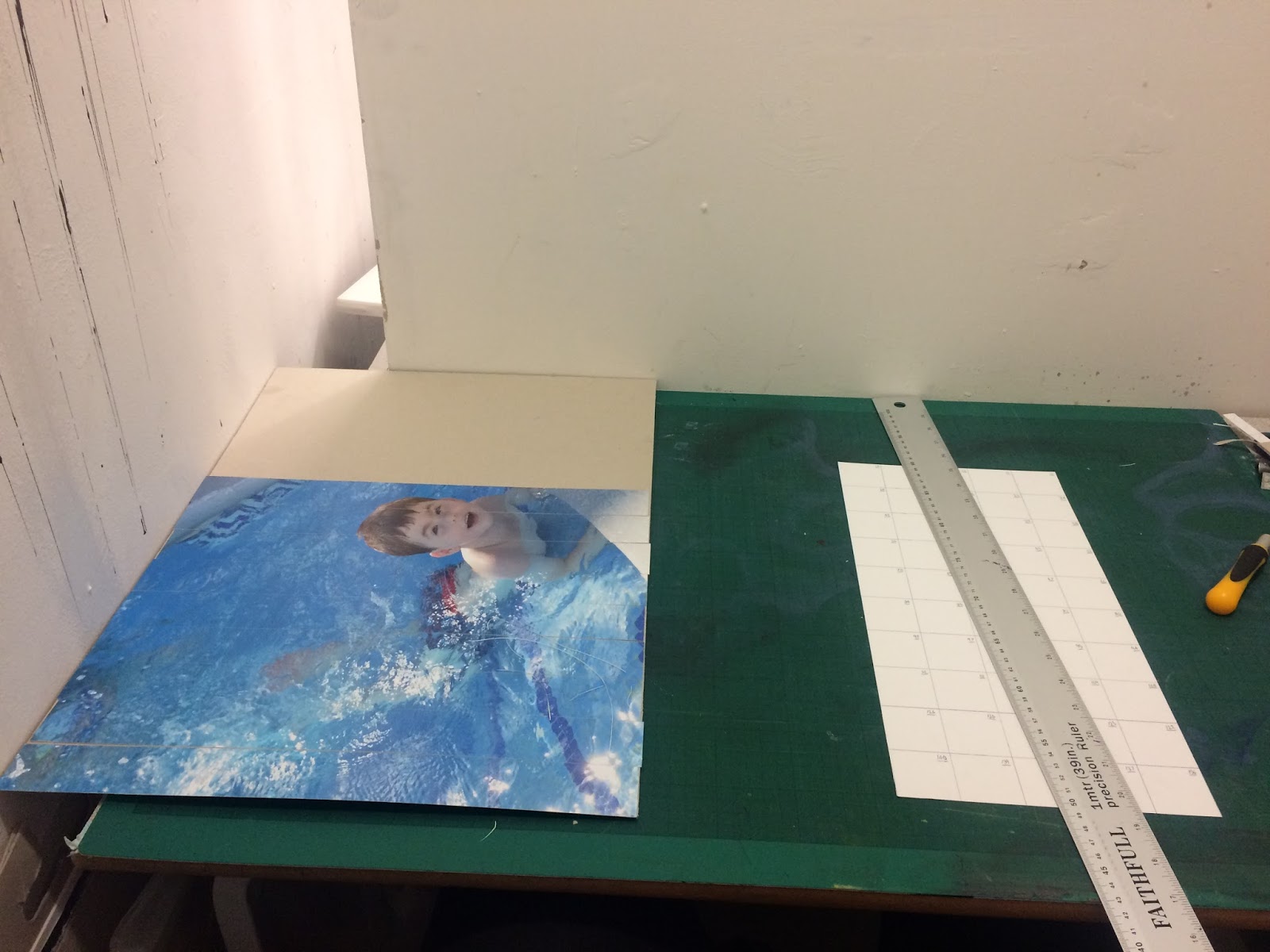
I tried it again on a larger scale as a draft final outcome. I did this one in black and white so that I could compare the two and come to a final decision on whether I was going to do it in colour or not. This time I varied the size of the squares, cutting the ones with the figure in into even smaller pieces than the other squares in the composition. After completing this one I knew that I was definitely going to do my final outcome in colour as the back and white didn't look as interesting or have the same meaning as the coloured version of the photograph. I had decided to do my final outcome on the next scale up which was A2 on photo paper.
My intentions for Component 1 were to base my work on figures. My initial thoughts were that I had never really worked with figures before so I wanted to try something new and try and incorporate emotions into my work that were pure and raw at the the time of the event.
I didn't continue this because I did a collage and paper cutting experiment and found I quite like the technique and working with this style so I decided to change the direction of my Personal Investigation. I then investigated this by taking the photographs from my holiday of friends and family and creating interesting collages inspired by my three artists David Hockney, Claire Pestaille, and Annegret Soltau. I feel like I could have found some more collage and paper cutting artists to extend my ideas and to help have even more influence on my work so that I could do further experiments using different styles and the develop my work even further than it already is.
 |
| The picture I used from my Spain holiday for my final outcome. |
 This was one of the first experiments that I did that led to my final outcome idea. It was inspired by David Hockney's Polaroid pieces of artwork. I did like this experiment however I felt it was way too simple and a bit boring so I wanted to develop it further to see if I could create something interesting. I think the composition worked because I tried to use images that looked like they were around the same level in the sea, with the top three photos being the top of the sea and the bottom three being the sea floor.
 I moved on to do another experiment, this time on a smaller scale but using the same idea with the Polaroids. This time I just used one photograph, cutting it up into square and leaving gaps between them, making it quite symmetrical. I really liked this experiment, I think it looks more successful because the cut out squares are smaller so it looks more detailed and a bit more complex. I did however still think that I needed to develop this style further.
 I decided to continue with the style of cut out squares, however this time I decided to concentrate on a small are of a photograph and to cut out really small squares to see what effect it would have with really small cubes. I did like this experiment, however I thought it was difficult to tell if it was very successful as you cannot see much detail with the re-arranged squares as they have been cut up so small. I knew I was definitely heading in the right direction with the cut out squares, it was just a case of experimenting further to find a method that worked.
I tried cutting up the whole image into squares again, however this time I did them smaller and I decided to remove all of the squares that didn't have any part of the figure in them. This was inspired by David Hockney's piece 'Robert Littman Floating in My Pool', I wanted to incorporate the 'blanc' space into my own work to see how it impacted the composition and if it made it more successful. I think that this experiment was definitely interesting however, when I did it I still felt that it was missing something.
 I decided to go back to cutting up a whole photograph into squares. However this time I turned every other square upside down to see what it would look like. I really liked it, I felt that this made it much more interesting and it gave it more of a cubist element with the distortion.
  I then did another experiment using cut out squares, this time I made them smaller and I swapped every other square in the section with the figure in it. I loved the effect this had. The distortion was very subtle, and despite how simple the method was, I felt that it was very effective.
I tried it again on a larger scale as a draft final outcome. I did this one in black and white so that I could compare the two and come to a final decision on whether I was going to do it in colour or not. This time I varied the size of the squares, cutting the ones with the figure in into even smaller pieces than the other squares in the composition. After completing this one I knew that I was definitely going to do my final outcome in colour as the back and white didn't look as interesting or have the same meaning as the coloured version of the photograph. I had decided to do my final outcome on the next scale up which was A2 on photo paper.

My Final Personal Investigation Piece was mainly influenced by Claire Pestaille and David Hockney. The piece has similarities to David Hockney with the use of a photograph containing a swimming pool and lots of the colour blue. I based my piece on Claire Pestaille's crystalline series, the layout I used was different as I restructured the squares differently to her, and I also had some different sized squares in my final piece to have more of a variety and to allow me to rearrange the squares more to make the photograph appear even more distorted. I used an A2 sized photograph printed on photo-paper for my final piece. I created line and shape by cutting the photograph into squares and placing them in a grid format. The final piece is very personal to me because it is a photograph that I took over the summer holiday in Spain of a family friend’s son Tom, we are very close to them and went away with them to Spain in the summer.
I am pleased with my final outcome and I really like the finished product of my Final Piece, there were ups and downs during the process of making it however I think it looks really successful now that it is finished. It was a combination of my experiments which were inspired by both David Hockney and Claire Pestaille with the cut up squares and distortion. I think that my final outcome does have an element of cubism to it which I like. I like the subtle distortion of the photograph from the way I have composed and arranged the cut up squares, I think it is very successful. The only thing I would change is the size, I would like to make it even bigger and perhaps have even more smaller squares to take the distortion of the photograph further. I also think it would be better bigger as at the David Hockney exhibition I saw how huge his photographic collages were and I think it would have been easier and better to be able to include much more detail if I did it on a much larger scale. Other than that I was very happy with my Final Outcome for my them figures in Component 1. Perhaps I will develop this technique even further next year when I am doing my Art Foundation Diploma.