Tuesday, 24 January 2017

This piece is also inspired by David Hockney, I cut the photograph up into small squares and then removed the ones that didn’t have any parts of the figure in. I arranged them with small gaps in between to give the impression of Polaroid photographs. I really like this piece I think it is simple yet effective and the absence of the rest of the image makes it seem almost like pixels that are slowly forming to make up the whole image however it hasn’t quite finished yet as it has froze which is what I personally feel it gives the impression of which I quite like.


Whilst I really like the original coloured version of this piece I love the contrast between the cut up squares of the photograph and the white background, I think it really makes the composition stand out. The monochrome print appears to really highlight the light shining through the water which I really like as it gives the composition more atmosphere and energy. I think that the piece looks like the person is disappearing as there is a lot of white space to the right of the piece making it look like the image is unfinished and is fading away before it has been pieced together again, hence the white gaps between each square.


I decided to try and incorporate my stitching into this piece to see how it would look as I have started combining my techniques to develop my experiments further. I didn’t finish this piece because after doing a bit of stitching I realised I didn’t really like the effect the stitching was having on the piece and because I knew it was going to take a while I decided I didn’t want to spend ages finishing it when I knew I was not going to like the outcome.
This piece was inspired by Annegret Soltau’s work. I particularly focused on her compositions where she ripped out a hole in the middle of the photograph and stitched them to another image underneath and I decided to combine two photographs featuring the same person. I think that this piece is really successful because composition is structured well. I think that this piece looks like the person is jumping into another universe which I really like.
As the two figures in this photograph had just their heads and shoulders out of the water I decided to combine it with another photo containing a figure with just his head and shoulders out of the water. The similarities between the two photographs help to balance the composition and make it work as there is a clear link between the two photos. I think this piece is really successful because it looks like the other image is supposed to be there other than the slight change in the shade of blue. 
I decided to try stitching a ripped section of a photograph with only a small section of it being on the photograph. I chose these two images because the figures are both looking in the same direction. I think that this piece is kind of successful however I think the technique of ripping a hole in the photograph seems more successful than this style, perhaps because the composition is more balanced where as this piece isn’t really balanced because of the overlap on the bottom right.
I chose these two images because they are both underwater so I thought they would fit well together. I decided to rip the photograph by trying to go around the figure but still keeping it quite central. I think that this composition works well because it is well balanced structurally as it looks like it has near enough been slice equally from top right to bottom left. The colours from both photographs were very similar and blended well together.
I decided to go back to stitching with a hole in the middle of a photograph as I felt that these ones were more successful. I picked these two photographs because I felt that the shades of blue in the water were very similar and also the arms look like they are reaching out in the direction of the two figures in the water. I think this composition is not as successful as the others, perhaps because of the difference in size of the figures or maybe because you can’t see the whole of the figure underneath's body. Whilst it may not be as successful as the other pieces I still really like this work because it looks like we are looking in on another universe where the figure is in the same pool but doing a different activity.
I took inspiration from David Hockney’s composition piece Robert Littman Floating in My Pool, Oct. 1982. The composition was made by layering different photos of sections of the body in different positions to give the impression of movement. I picked this photograph because I felt that it would work well for trying to do something experiment with this style of collage. I printed off several copies of the same photograph and stuck one whole photo down. I then cut up different sections of the body from the remaining photographs and placed them in slightly different positions over the original photograph. I feel like this piece was really successful, I think that I have captured the style of movement really well as it looks almost like freeze frames from different positions in the air as he gets closer to the water. The style is very simplistic and not too overwhelming which makes the composition flow nicely. I also personally feel when I look at it that after seeing the layered sections of the figure my eyes automatically move to the right of the image as if expecting to see the impact of him hitting the water and the big splash that comes with it.
You lose the beautiful shades of blue and the details of the water rippling in this version of the composition. The black and white print seems to sharpen the image compared to the coloured piece which is smooth and quite calm looking. I definitely prefer the coloured version as I feel like you connect more to the piece because of the colours it gives you more of a feel to the location and the warmth of the summer and the pool to cool down in and have fun playing in.
I felt as though the piece with the photograph and the cut out shapes was quite successful and so I decided to try it again on this photograph so that I could compare the three different styles done on the same photograph. I feel as though this composition kind of works however it looks to me as if something is missing. I think that maybe it is the way that I have cut shapes into it that ruin the balance of the photograph. The more I look at it the more I realise I don’t like it because I think it is too simplistic.

Personally I feel as though the black and white actually makes this composition better. I think the contrast between the white cut out shapes and monochrome photograph works really well and helps to balance the composition more than it is in the coloured piece. This is quite surprising because the black and white version of the last composition didn’t work very well which I think shows that it is not just about the colour the photograph is but it is about the technique applied to the image.


I decided to combine the two styles together to see how they worked and if it worked better as a composition with the two combined, this way I could compare the three to see which worked best. Combining the two styles I personally think improves it from the last piece massively, it gives the composition more balance and it gives it more to focus on rather than just some simplistic cut-out shapes. However whilst I think it is an improvement to the second one I feel that compared to the first one this is the least successful and I prefer the structure of the first piece.


This monochrome version of the composition I felt was not very successful. There is not enough contrast between the cut out shapes and the tone of the water. The layering of figure also doesn’t stand out as much in black and white so you don’t get the full effect. I think that the original coloured version works much better than this as you can fully appreciate the techniques of collage and paper cutting combined.


I decided to try and make this technique even more like David Hockney’s actual piece ‘Robert Littman…’ so I decided to photocopy the first style I tried and I cut out the figure and then a couple of random sections from the background of the photograph. I removed the majority of the background leaving lots of ‘blanc’ space and placed the two sections of the background further to the right in different positions to make the viewer of the piece almost fill in the gaps with the rest of the image so what they see is completely different for each person as it is completely open except for the figure, a section of the pool and a section of the sky. Whilst I like the theory behind the piece and I think when applied it works well I don’t actually think the composition is successful. I don’t think that the piece has the right balance so it doesn’t feel right when you look at it. I much prefer the original composition with the layering of the figure over the original background I think it has the right balance and works well compared to this piece.

Monday, 23 January 2017

Life Drawing

I did a session of life-drawing which was my first time ever doing life drawing. I found it difficult at first to get the proportions right of the model and I was struggling with the time of 10 minutes as I couldn't finish my full body drawings. I tried then to use a wire skeleton to try and help me with the proportions of the figure however I found that I was then spending most of the 10 minutes focusing on getting the proportions correct rather than drawing the figure. I realised that using pencil probably was not the best material as it was very restricting for the short amount of time I had to do each 10 minute drawing so I decided to use a Biro-pen without the skeletal wire which I found worked really well as I managed to get the whole body drawn and some of the other subjects in the background. We then had the model do some more straining poses and had only 5 minutes drawing time so I decided to use graphite and focus on specific sections of the body and mark making to create the tones and shapes of the body. I personally feel as though the pen and graphite drawings were my most successful of all of the studies I did and I have decided to do some more quick 5/10 minute drawings of my family and friends to try and capture body shape and proportions to help me have a deeper understanding of figures and people and the shapes the body can make rather than the details of the person.

Sunday, 22 January 2017

Experiments with Photographs and Film

We were shown a film called NOVA which was about some young modern artists putting together compositions in an art gallery and it was showing them talking about their work as well as the process making it. There was a short animation film shown called Topologies (excerpt) by Quayola, which showed what appeared to be paper with 3D shapes coming out of it and moving around.It reminded me of stop-motion animation and it gave me the idea that I could take a a burst of photos of my friends moving around and then put them into a video to represent a similar thing of something slowly moving around the screen, I added a tapping sound to it to sound like it was flicking through the images and to add to the sense of movement on the screen. I did this with a few different photo bursts to see whether it was very effective or not.


I think these videos are very successful as they seem to work really well composition wise. However I don't really know how to develop them further at this point when comparing them to the other experiments I have been doing so I have decided to just keep them as one off experiments for now.


My focus artist was David Hockney who is a well know artist that works with photographs and also has a series of water compositions. There was a piece that he did called Sun On The Pool Los Angeles April 13th 1982 which he created using Polaroid photos. I decided to focus on my holiday photographs which were not done with Polaroid so I decided to try and imitate this style he used with my own water photographs, leaving white gaps between each photograph to try and give the impression of Polaroid photos. I chose the photos based on water, placing the underwater photos near in the last two rows and then the photographs that were on the surface or close to the surface on the top row. I decided to do this to create the illusion of someone actually going underwater deeper and deeper, so the top row is what they would see just as the person enters the water and then the further down they go they start to see different fish and then they reach the bottom and they see the sharks and the sand of the sea floor. I did this piece large scale on A1 paper so that I could use bigger photographs to allow you to be able to look closely at each individual photo and then all of them together as a composition. 
Sticking with my theme of people, I decided to focus on the photos that I had taken over the summer of family and friends when we went on holiday to Spain. I fell in love with the beautiful blue colours in the photographs which also influenced my decision to stick with just the holiday photographs. In this work I decided to cut out different shapes in the water area and I wanted the shapes to represent the movement of the water. I feel that this piece is not entirely successful as it is very busy and not all of the shapes are noticeable (i.e. the swirl in the bottom right corner). I think that it would have been better if I had stuck to one type of shape instead of trying to combine different shapes as it doesn’t allow the composition to flow nicely.
I did a black and white photocopy of this piece to focus on tone so that I could compare the two. I feel as though the black and white version is not as successful as the coloured version. There is less depth in the composition and for me it looks tacky and seems to lose the extra detail you get from the coloured version. I love the different blue tones of the water in the coloured piece which I feel you really miss out on in the black and white piece and it also seems to lose its balance without the colour.


I decided to try again doing paper cutting but using my own drawing, as I had drawn the figure from the photography onto white paper I decided to cut the figure out and stick her onto black sugar paper so that there would be contrast between the figure and the background. I also thought that by doing this it would allow the shapes cut into the background to be more visible and it would make the composition more balanced with white shapes and the white main subject of the piece.

This is the finished version of the previous image. I cut out some wavy shape to try and represent the movement of the water however I changed the drawing from the photograph I drew it from by just focusing on the figure and not including anything else from the photograph. I did not feel that this piece worked well as I think it was too simplistic and I think that the lack of detail in the piece makes it hard to appreciate it. It definitely was not as successful as the first style I tried with my other charcoal drawing composition I think perhaps it was the black background and the negative space that stops it from working.
As the last drawing composition failed to work successfully I decided to try it again however this time I used Biro pen for the figure to try and get more detail into this piece as there was a lack of it in the last composition. I kept the white background in this piece of work to see if the style of paper-cutting would work better and decided to then stick it over black paper to make the cut out shapes stand out and contrast with the background. I also did less cut out shapes in the background to try and not make the piece to overwhelming and to try and prevent the focus moving from the figure in the piece to the black shapes seeping through the background. I sprayed hairspray over the Biro pen drawing and moved the paper around to try and create a water effect as she is in the water in the photograph. However once I had sprayed the hairspray over the piece and manipulated it around I realised that by doing this I had actually stripped away the detail from the figure and made her almost translucent which was not what I wanted as it meant that the figure now looked lost compared to the shapes and contrast in the background. As this didn’t work I decided to refine it and draw back over the figure to make the lines bolder so that the figure would stand out again.
This is the piece once I had refined it and as you can see the figure now stands out a lot more in comparison to the background which has improved it greatly from before. However I feel that the composition still doesn’t work, it could be the style in which I have cut out the shapes but I felt as though this style actually had worked really well when I did it on the photograph. I think again that it is the lack of detail in the background that prevents the piece from actually working much like the last composition I did with the charcoal drawing. When compared to the photograph pieces and my first drawing composition I noticed that there was detail on the majority of those pages with little blank space which I realised seems to make the paper-cutting more successful so I decided to stop for now with the drawing compositions and to focus more on the actual photographs.

Artist Study

One of the artists I have decided to look at is David Hockney. The idea came because I had some photographs that I took on holiday in the swimming pool and I decided to cut them up, creating shapes that I felt reflected the water in the photographs. This reminded me of David Hockney’s ‘Water’ pieces and I felt that his work was inspiring and relevant to the direction I am taking my personal investigation. David Hockney is an English painter, draughtsman, print-maker, stage-designer and photographer. He was an important contributor to the Pop Art movement of the 60s and is considered to be one of the most influential English artists of the 20th Century.

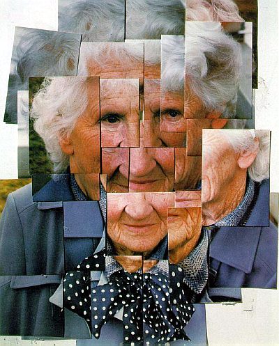
Figure 1 - Mother
I really like his piece “Mother” which is a photographic collage that is shown in Figure 1. This piece of work consists of many copies of the same photograph of his mother that have been cut up into smaller rectangles. Hockney has over-laid these photos to create interesting lines and edges in the piece whilst also changing the shape of his mother’s face by spreading the photographs out more instead of keeping them all really condensed. He has also changed the shape by having multiple copies of some sections of the face placed next to each other in different positions which almost distorts collage and gives it a pixelated effect. I really loved how he has used the same photograph multiple times to create a collage instead of combining loads of different photographs, I feel as though it works really well because it has the same colour scheme throughout with similar tones so you can still focus on the subject of the piece which is his mother, rather than your attention being drawn away by contrasting photographs. I felt really inspired by this piece as I thought I could try a similar method but using pictures of my own family and friends which makes it more personal to me. I also thought that I could perhaps use this style to create a collage of a friend or family member who had sat through various poses in the photographs to create a new pose and body shape.


Figure 2 - Robert Littman Floating in My Pool
Another piece that I felt really inspired by was “Robert Littman Floating in My Pool” shown in Figure 2. Like Figure 1 this piece consists of a collage of cut-outs from multiple copies of the same photograph. This time Hockney has only used the images that have parts of the figure in them, with the majority of the piece being left as a white background. I feel as though this really speaks for itself and is a literal representation of fill in the blanks because the background is white which is ‘blanc’ in French and you can clearly see that the figure is mainly under water so your brain automatically starts to fill in the ‘blanks’ with the rest of the water that has been deliberately left out of the collage. Again I find it interesting how he has placed the photographs as they have created lines and edges on the piece. It is also interesting how there are two specific cut-outs that show two different parts of the body that have been completely separated from the other photographs and have been place on the right side of the piece with space between the two. Perhaps this was done to give an illusion that there are more people in the pool as these two specific cut-outs appear to be from a different photograph as the angles of the body parts are slightly different than those in the main piece of the collage, however the shorts appear to be the same so he could be layering them in a different position to give a sense of movement in his piece. As the colours and tones are so similar in the collage it is very hard to pinpoint exactly if the cut-outs are all from the same photograph or not, the photographs are very tightly placed with smaller cut-outs which makes it hard to differentiate.

Another artist I am looking at is Claire Pestaille who I found after I did a collage piece with a photograph of my mum and I discovered I had done something very similar to her Cinema II series. Whilst looking at her work I found that I quite liked what she did with her compositions and I decided to try her style of collage on my own photographs. Claire Pestaille’s work looks at historical and contemporary iconography with her pieces focusing mainly on women and femininity through disruption of photographic imagery. She uses lots of portraiture from the Golden Age of Hollywood, incorporating stills from films as well as contemporary and vintage photography.

Figure 3 - Milada Mladova, New York, 1939
I was really inspired by her ‘Crystalline’ series and particularly liked the composition shown in Figure 3 of Milada Mladova, 1939 in New York. This piece is a paper collage which consists of a disrupted vintage photograph that is geometrically divided, squared and cut, and contains duplicates of the photo which have been reassembled within the format of a grid to produce a simultaneous double. The image used is black and white is the rest of her work. The black and white I feel really helps you to focus just on the figure and the technique of the collage as your eyes are not disturbed by any other colours in the backgrounds or other areas of the image because it just focuses on tone. I think this style works very well in this composition because the movement of the squares is very subtle so you follow the path of the disruption to the right of the piece.  I was really inspired by the techniques of the gridding and wanted to incorporate this into my own work. I will use this with my coloured holiday photographs because the main colour component of these images is blue which I think will still allow the focus to be on the technique of the collage and the figure much like Pestaille’s black and white collages.

Claire Pestaille’s style of work is very different to David Hockney’s. Whilst they are both collage artists the main difference is Hockney largely uses colour in his collages unlike Pestaille who focuses on black and white and sepia. I think that the reason for this is because they use different sources to make up their compositions. Pestaille uses lots of old, vintage photographs from before coloured photography was invented where as Hockney uses a lot of Polaroid images which he has taken mainly in the 80s when coloured photography and pola-colour was widely used. You could argue that there is some similarity with gridding as David Hockney has done some collages where he has put the Polaroid images in a grid like structure with them forming square like shapes which is similar to Pestaille’s ‘Crystalline’ series however the difference being there is white space between the actual images in Hockney’s work.


Figure 4 - Motherhood
The third artist I am looking at is Annegret Soltau. She combines photographs of faces and people by tearing images and then stitching them together using thread to create a new, grotesque composition. I really like the technique she uses and I think I could take this as well as the idea of using thread and incorporate it into my collages. I could also combine the different artist styles to see if they work well together and compare them.

Artist Research

David Hockney
Prehistoric Museum Near Palm Springs, 1982
Robert Littman Floating in my Pool, Oct. 1982
Photographing Annie Leibovitz While She Is Photographing Me, Mojave Desert, Feb 1983
Celia's Children Albert + George Clark Los Angeles April 7th 1982
Nicholas Wilder Studying Picasso, Los Angeles 24th March 1982
Patrick Procktor, Pembroke Studios, London, 7th May 1982
Sun on the Pool Los Angeles April 13th 1982
David Hockney's photo collages and montages, known as 'Joiners', caught the eye of the public in the 1980's. The creation of the joiners had actually occurred accidentally. In the late 60s he noticed that photographers were starting to use cameras with wide-angle lenses to take pictures, which he wasn't particularly fond of because they always came out somewhat distorted. He was working on a painting of a living room and terrace in Los Angeles where he decided to take some Polaroid shots of the room and glued them together, not actually intending them to be a composition on their own. When he looked at the final composition, he realised it actually created a narrative, as if the viewer of the piece was moving through the room. After this discovery he began working more and more with photography and exclusively pursued this new style. From 1982, he explored the use of camera, making compositions of Polaroid photographs arranged in a rectangular grid, later on using prints to create photo collages where he compiled a complete picture from a series of individually photographed details. The idea behind his use of grids was to try and make his pieces have an element of cubism.

Claire Pestaille
Carmen Dell' Orifice
Chrystal Time
Candelabra 
Madelaine
Isabelle
(Romance: The Big Sleep)


Claire Pestaille's 'The Crystalline Project' is a collection of disrupted vintage photographs, film stills and studio portraiture of women from the golden age of Hollywood. Duplicate images are geometrically divided, squared and cut, then reassembled like a jigsaw puzzle within the format of a grid in order to produce a 'fractured circuit' or a 'simultaneous double'. The grid format becomes both the 'compositional and conceptual device' for the theatrics of the deconstruction of the collage to take place, it is a place where identity is questioned, formed, reconstruction and also at time made unrecognisable.

Cinema II was another series of collage work that she did, it was actually one of her fist series produced which was inspired by film stills and Hollywood portraiture. It was based around stop motion and the concepts of time and movement as Pestaille finds this really interesting. The compositions produced in this series utilise single and double images of iconic portraits of Hollywood actors and actresses. They are sliced in vertical strips and the portraits are then layered to form a surreal visual experience and the optical sensations of vibration, movement and mutation.

Annegret Soltau
Motherhood
Grima


Motherhood
Annegret Soltau uses needle and thread to create grotesque looking collages, she rips up different images, mainly of peoples faces and combines them by stitching them together to create a new composition.

Saturday, 21 January 2017

This is the next experiment I did using a different photograph from the same day as the last photograph. I noticed the wind was bowing my mum’s hair vertically in this photograph and decided the cut the picture up in vertical rectangles, I then decided to move them slightly further to the left/right to try and emphasise the wind in the photograph and to physically create the movement of the wind. The image is distorted as it flows from left to right and the movement appears very dramatic. I liked the effect that was created on the image by moving the individual pieces slightly, however it would probably have been easier to cut on a larger scale so that I could get evenly cut strips of the photograph. When looking for artists I discovered that this style was similar to the artist Claire Pestaille so I decided to look at her as one of my main artists.
I did a charcoal drawing from this photograph and then I decided I wanted to do something interesting with the photograph itself. I then had the idea of cutting out a circle and then cutting it into smaller and smaller circles and to slightly rotate each one. I did this and found I really liked doing this creative process and wanted to continue it so I moved away from my figurative drawing to continue experimenting in this style. I felt as though this experiment would perhaps have been better on a larger scale and if there was not as much of a white space between each circle.


This is a black and white photocopy of the piece. I did this so I could see what it would look like if I just focused on the tone. I feel as though I like it in black and white but I also like the coloured version. Both pieces have different qualities to them, it appears that the black and white composition stands out more however I also like the subtlety of the movement in the coloured piece. The white gaps stand out more in this piece because there is more contrast with the white underneath and the darker tones in the image.


This is the charcoal drawing I did of the photograph on the previous slide. I used compressed charcoal and white chalk to create the contrast between the tones of the hair and the shading of the face. Whilst I liked the drawing, I wasn’t entirely happy with it the way it was and didn’t want to just leave it as a drawing so I decided to cut it up in the same style as I did previously with the actual photograph.


Here is the finished piece of the charcoal drawing combined with the paper-cutting. I thought that this composition was really successful as the ‘illusion’ in the drawing is very subtle as opposed to being very chaotic which I think worked really well.

My Short Film

I did this film as a little experiment in relation to my theme of figures for my personal investigation. I decided to find footage taken of me and my friends having fun together and then combine them together to make a film. I used this song because I felt that it really matched the emotions of joy and happiness in the footage taken so it fit really well.
   

Genre Study

Originally for my Personal Investigation there were two key genres that I wanted to look at; Expressionism and Post-Impressionism. I had chose these because I preferred these styles of art to more realistic artwork for my chosen theme of ‘Figures’, I felt that you are freer to express yourself with the marks and colours that you choose to use which I enjoy doing. Also I was not used to doing figures so I wanted to give myself more room to experiment and not focus on perfect and very detailed people. My direction for my Personal Investigation changed when I decided to do an experiment with paper cutting and collage using one of my photographs I had been drawing from. I realised I really enjoyed this and I wanted to explore it further as it seemed different and more exciting than just doing paintings and drawings therefor now for my Personal Investigation I am going to focus on two key genres; Paper-cutting and Collage.

I am going to focus mainly on collage because I will be looking at how I cut things out and stick them back down. As I initially got the idea and inspiration to change my direction to collage and paper cutting from the initial piece using my photograph from the summer holiday I want to continue this theme and carry on using my summer holiday photographs for my collages making it more personal to me.

Paper-cutting is the art of cutting paper designs. Collage is a technique of an art production, primarily used in the visual arts, where the artwork is made from an assemblage of different forms, thus creating a new whole. A collage may sometimes include magazine and newspaper clippings, ribbons, paint, bits of coloured or handmade papers, portions of other artwork or texts, photographs and other found objects, glued to a piece of paper or canvas. The origins of collage can be traced back to hundreds of years, but this technique made a dramatic reappearance in the early 20th century as an art form of novelty. The term collage was invented by both Georges Braque and Pablo Picasso in the beginning of the 20th century when collage became a distinctive part of modern art.

The artists I am interested in looking at now for my Personal Investigation are David Hockney, Claire Pestaille and Annegret Soltau. They are all collage artists and relate to my theme of figures for my Personal Investigation as they all have people as the main subject of their work. I chose David Hockney because he has done quite a few pieces with water in them which link well to my holiday photos of the swimming pool. I was unable to see David Hockney’s work in a gallery because most of his work is privately owned or in galleries in other countries, however in February there is going to be a special David Hockney exhibition at the Tate Modern gallery in London so I will be going to that to see his work up close and personal. It will be interesting to see how he actually did his compositions in person rather than just looking at pictures on the internet.

My plan for my personal investigation is to do lots of experiments using the different collage techniques inspired by my artists and any ideas I come up with myself so I can figure out which ones work best and link well with my theme of figures. I can then develop the more successful pieces further until I come up with something that could be my final outcome for my Personal Investigation.